Barefoot Books Logo Refinement
Barefoot Books is an independent publisher of award-winning books and gifts for children known for it’s vibrant artwork, creative retellings of traditional tales and a commitment to environmental and multicultural themes. Distribution bypasses big box bookstores in favor of an international direct-selling program, e-commerce, trade markets and experience-driven Barefoot Books retail centers.
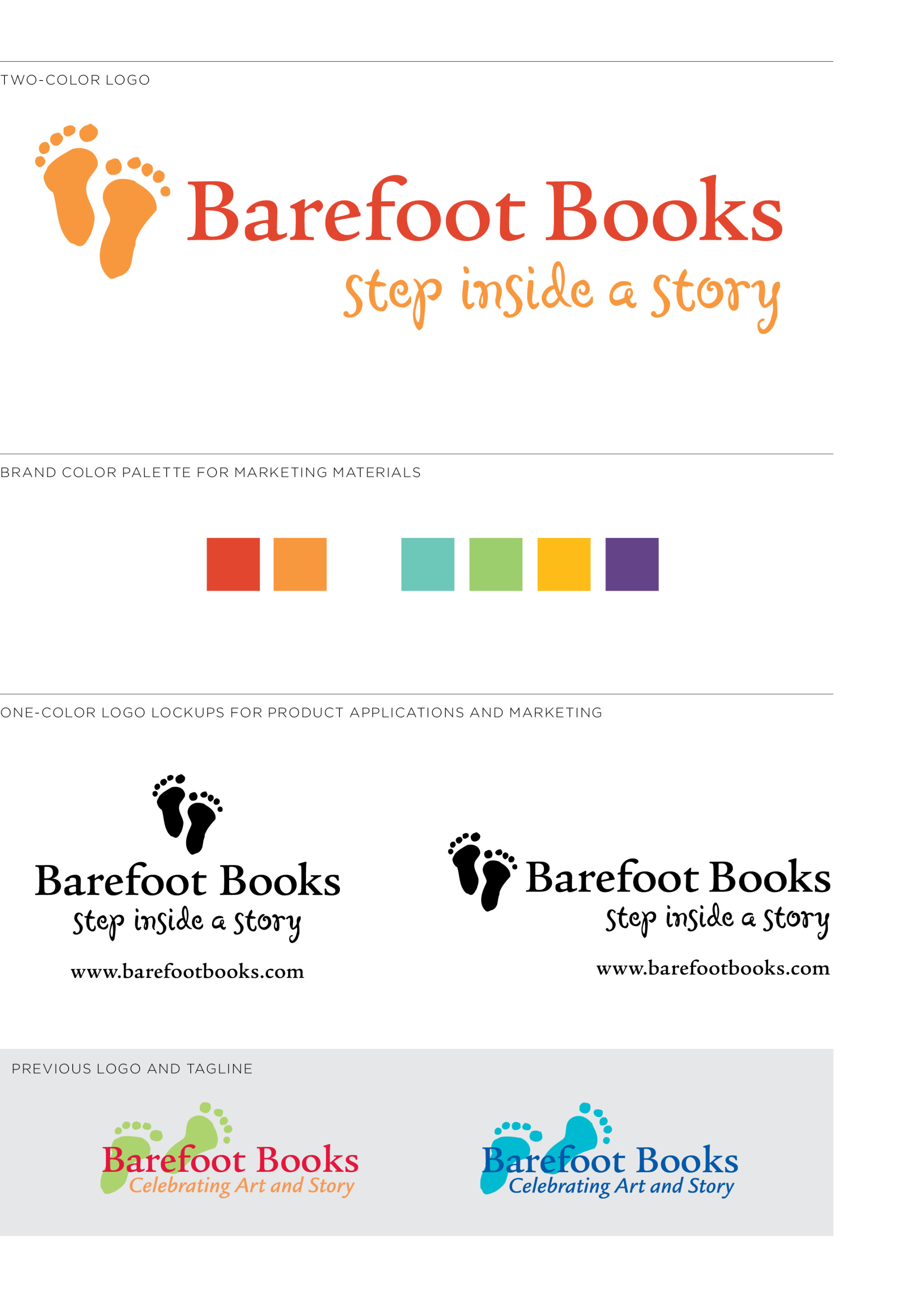
As the product offer grew beyond books to puppets, music and games, the Barefoot Books identity needed to better reflect the depth of the brand. Executionally, the previous logo’s overlapping elements weakened brand presence by requiring an unlimited color palette that was often lost on colorful products and marketing collateral.
After an audit of the visual brand through the years, refinements to the logo and tagline were recommended. The approachable serif typeface and recognizable foot-prints remained, representing the literary and playful pursuits at the heart of the company’s mission. Kerning adjustments, repositioning of elements, additional lock-ups and a defined color palette all help to ensure visual consistency across print, online and product applications. While the existing tagline stated a true company value, the recommended “Step inside a story” delivers the brand promise of creative exploration more directly to the target audience in an appropriately artful typeface.
Role :: visual brand audit, brand strategy, design development, tagline development